Peter Lobner
Representing the Earth’s 3-dimensional surface on a 2-dimensional map is a problem that has vexed cartographers through the ages. The difficulties in creating a 2D map of the world include maintaining continental shapes, distances, areas, and relative positions so the 2D map is useful for its intended purpose.
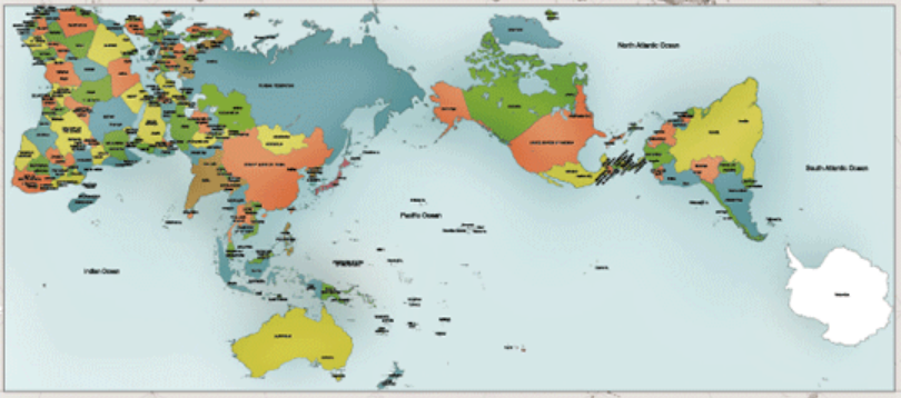
 World map circa 1630. Source: World Maps Online
In this article, we’ll look at selected classical projection schemes for creating a 2D world map followed by polyhedral projection schemes, the newest of which, the AuthaGraph World Map, may yield the most accurate maps of the world.
1. Classical Projections
To get an appreciation for the large number of classical projection schemes that have been developed to create 2D world maps, I suggest that you start with a visit to the Radical Cartography website at the following link, where you’ll find descriptions of 31 classical projections (and 2 polyhedral projections).
http://www.radicalcartography.net/?projectionref
Now let’s take a look at the following classical projection schemes.
- 1569 Mercator projection
- 1855 Gail equal-area projection & 1967 Gail-Peters equal-area projection
- 1805 Mollweide equal-area projection
- 1923 Goode homolosine projection
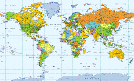
Mercator projection
The Mercator world map is a cylindrical projection that is created as shown in the following diagram.

Source: adapted from http://images.slideplayer.com/15/4659006/slides/slide_17.jpg
Source:https://tripinbrooklyn.files.wordpress.com/2008/04/new_world60_small.gif?w=450
Important characteristics of a Mercator map are:
- It represents a line of constant course (rhumb line) as a straight line segments with a constant angle to the meridians on the map. Therefore, Mercator maps became the standard map projection for nautical purposes.
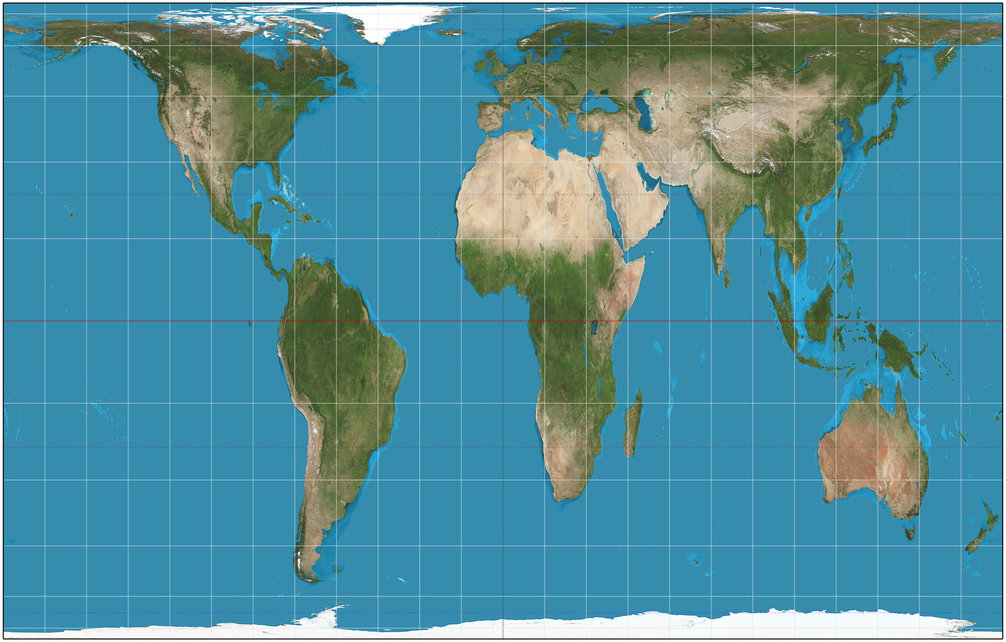
- The linear scale of a Mercator map increases with latitude. This means that geographical objects further from the equator appear disproportionately larger than objects near the equator. You can see this in the relative size comparison of Greenland and Africa, below.
 The size distortion on Mercator maps has led to significant criticism of this projection, primarily because it conveys a distorted perception of the overall geometry of the planet.
Gail equal-area projection & Gail-Peters equal-area projection
James Gail developed a cylindrical “equal area” projection that attempted to rectify the significant area distortions in Mercator projections. There are several similar cylindrical “equal-area” projection schemes that differ mainly in the scaling factor (standard parallel) used.
In 1967, German filmmaker Arno Peters “re-invented” the century old Gail equal-area projection and claimed that it better represented the interests of the many small nations in the equatorial region that were marginalized (at least in terms of area) in the Mercator projection. Arno’s focus was on the social stigma of this marginalization. UNESCO favors the Gail-Peters projection.
 Source: By Strebe – Own work, CC BY-SA 3.0, https://commons.wikimedia.org/w/index.php?curid=16115242
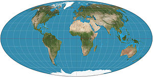
Mollweide equal-area projection
The key strength of this projection is in the accuracy of land areas, but with compromises in angle and shape. The central meridian is perpendicular to the equator and one-half the length of the equator. The whole earth is depicted in a proportional 2:1 ellipse
This projection is popular in maps depicting global distributions. Astronomers also use the Mollweide equal-area projection for maps of the night sky.
Source: Wikimedia Commons
An interrupted Mollweide map addresses the issue of shape distortion, while preserving the relative accuracy of land areas.
Source: http://www.progonos.com/furuti/MapProj/Normal/ProjInt/ProjIntC/projIntC.html
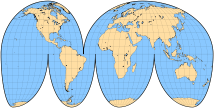
Goode homolosine projection
This projection is a combination of sinusoidal (to mid latitudes) and Mollweide at higher latitudes. It has no distortion along the equator or the vertical meridians in the middle latitudes. It was developed as a teaching replacement for Mercator maps. It is used by the U.S. Geologic Service (USGS) and also is found in many school atlases. The version shown below includes extensions repeating a few portions in order to show Greenland and eastern Russia uninterrupted.
Source: http://www.progonos.com/furuti/MapProj/Normal/ProjInt/ProjIntC/projIntC.html
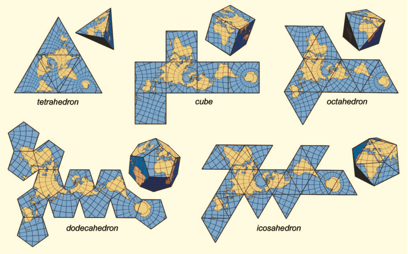
2. Polyhedral Projections
In his 1525 book, Underweysung der Messung (Painter’s Manual), German printmaker Abrecht Durer presented the earliest known examples of how a sphere could be represented by a polyhedron that could be unfolded to lie flat for printing. The polyhedral shapes he described included the icosahedron and the cuboctahedron.
While Durer did not apply these ideas at the time to cartography, his work laid the foundation for the use of complex polyhedral shapes to create 2D maps of the globe. Several examples are shown in the following diagram.
 Source: J.J. van Wijk, “Unfolding the Earth: Myriahedral Projections”
Now we’ll take a look at the following polyhedral maps:
- 1909 Bernard J. S. Cahill’s butterfly map
- 1943 & 1954 R. Buckminster Fuller’s Dymaxion globe & map
- 1975 Cahill-Keyes World Map
- 1996 Waterman polyhedron projections
- 2008 Jarke J. van Wijk myriahedral projection
- 2016 AuthaGraph World Map
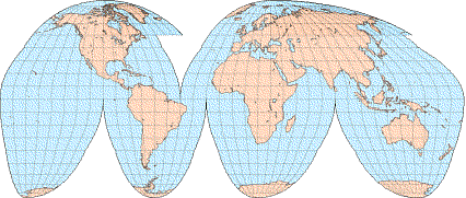
Bernard J. S. Cahill’s Butterfly Map
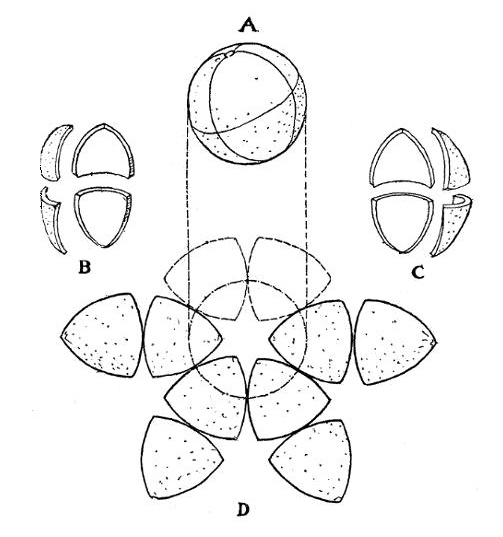
Cahill was the inventor of the “butterfly map,” which is comprised of eight symmetrical triangular lobes. The basic geometry of Cahill’s process for unfolding a globe into eight symmetrical octants and producing a butterfly map is shown in the following diagram made by Cahill in his original 1909 article on this mapping process.
The octants were arrayed four above and four below the equator. As shown below, the octant starting point in longitude (meridian) was strategically selected so all continents would be uninterrupted on the 2D map surface. This type of projection offered a 2D world map with much better fidelity to the globe than a Mercator projection.
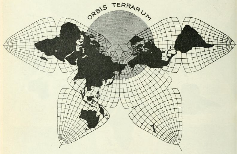 Cahill’s 1909 map. Source: genekeys.com
You can read Cahill’s original 1909 article in the Scottish Geographical Magazine at the following link:
http://www.genekeyes.com/CAHILL-1909/Cahill-1909.html
R. Buckminster Fuller’s Dymaxion Globe & Map
In the 1940s, R. Buckminster Fuller developed his approach for mapping the spherical globe onto a polyhedron. He first used a 14-sided cuboctahedron (8 triangular faces and 6 square faces), with each edge of the polyhedron representing a partial great circle on the globe. For each polyhedral face, Fuller developed his own projection of the corresponding surface of the globe. Fuller first published this map in Life magazine on 1 March 1943 along with cut-outs and instructions for assembling a polygonal globe.
 Fuller’s 1943 Dymaxion map. Source: Life magazine
 Fuller’s 1943 cuboctahedron Dymaxion globe. Source: Life magazine
You can see the complete Life magazine article, “R. Buckminster Fuller’s Dymaxion World,” at the following link:
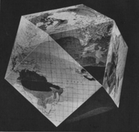
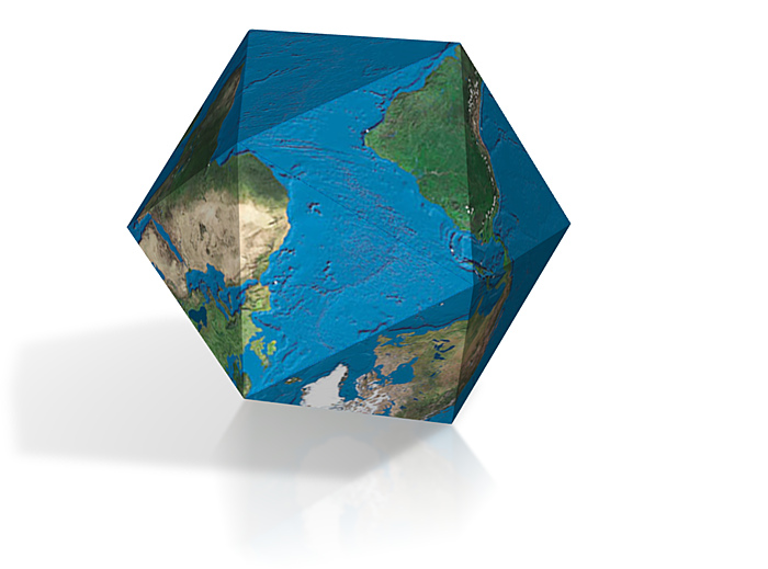
A later, improved version, known as the Airocean World Map, was published in 1954. This version of Fuller’s Dymaxion map, shown below, was based on a regular icosahedron, which has 20 triangular faces with each edge representing a partial great circle on a globe.
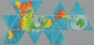 Source: http://www.genekeyes.com/FULLER/1972-BF-BNS-.25-.95.1-Sc-1.jpg
You can see in the diagram below that there are relatively modest variations between the icosahedron’s 20 surfaces and the surface of a sphere.
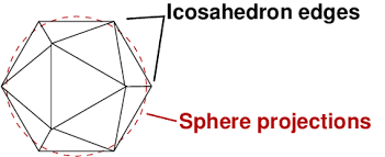
Source: https://sciencevspseudoscience.files.wordpress.com/2013/09/embedded_icosahedron.png
Fuller’s icosahedron Dymaxion globe. Source: http://workingknowledge.com/blog/wp-content/uploads/2012/03/DymaxionPic.jpg
You can watch an animation of a spherical globe transforming into an icosahedron and then unfolding into a 2D map at the following link:
https://upload.wikimedia.org/wikipedia/commons/b/bb/Dymaxion_2003_animation_small1.gif
Cahill-Keyes World Map
The Cahill–Keyes World Map developed in 1975 is an adaptation of the 1909 Cahill butterfly map. The Cahill-Keyes World map also is a polyhedral map comprised of eight symmetrical octants with a compromise treatment for Antarctica. Desirable characteristics include symmetry of component maps (octants) and scalability, which allows the map to continue to work well even at high resolution.
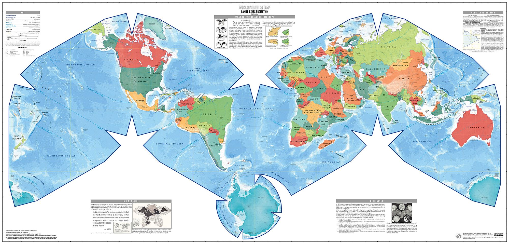 Source: http://imgur.com/GICCYmz
Waterman polyhedron projection maps
The Waterman polyhedron projection is another variation of the “butterfly” projection that is created by unfolding the globe into eight symmetric, truncated octahedrons plus a separate eight-sided piece for Antarctica. The Atlantic-centered projection and the comparable Pacific-centered projection are shown below.
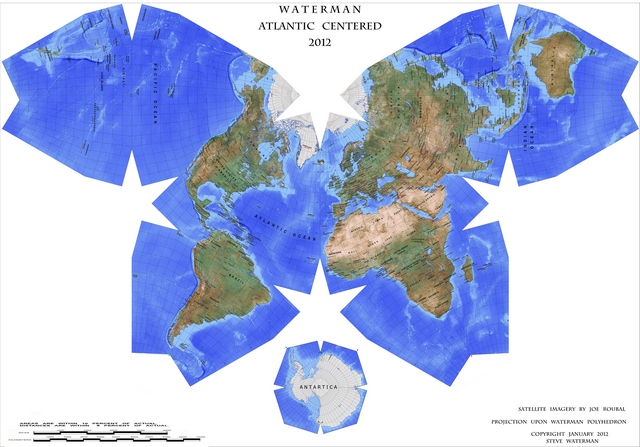
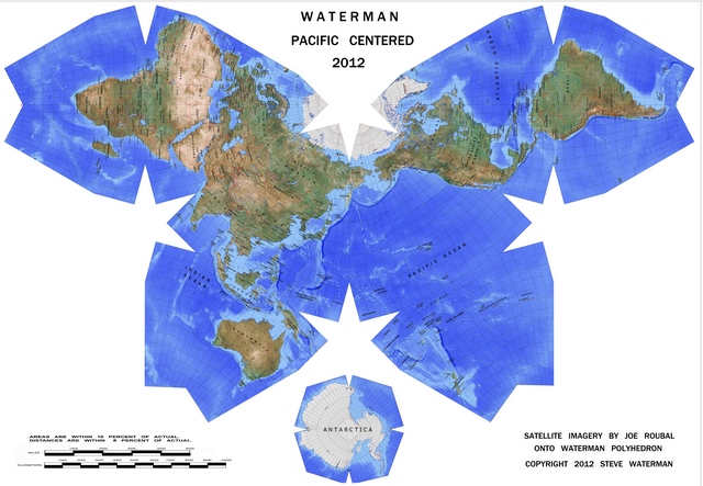
Source, two maps: watermanpolyhedron.com
The Waterman home page is at the following link:
http://watermanpolyhedron.com/deploy/
Here the developers make the following claims:
“Shows the equator clearly, as well as continental shapes, distances (within 10 %), areas (within 10 %) angular distortions (within 20 degrees), and relative positions, as a compromise: statistically better than all other World maps.”
Myriahedral projection maps
A myriahedron is a polyhedron with a myriad of faces. This projection was developed in 2008 by Jarke J. van Wijk and is described in detail in the article, “Unfolding the Earth: Myriahedral Projections,” in the Cartographic Journal, which you can read at the following link:
https://www.win.tue.nl/~vanwijk/myriahedral/
Examples of myriahedral projections are shown below. As you can see, there are many different ways to define a 2D map using a myriahedral projection.
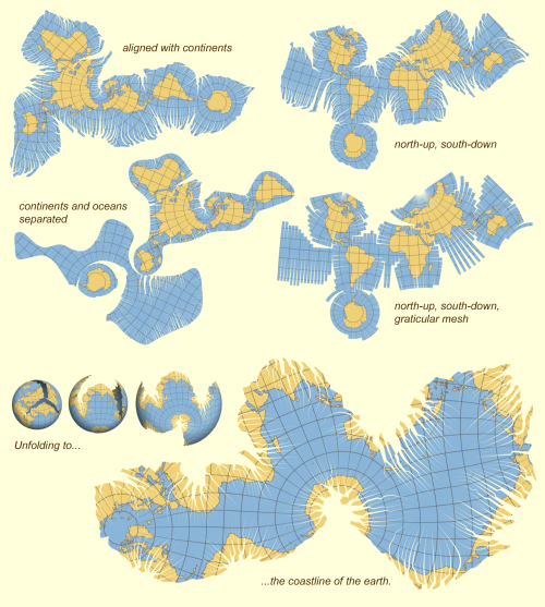 Source: https://www.win.tue.nl/~vanwijk/myriahedral/geo_aligned_maps.png
AuthaGraph World Map
The latest attempt to accurately map the globe on a 2D surface is the AuthaGraph World Map, made by equally dividing a spherical surface into 96 triangles, transferring it to a tetrahedron while maintaining areas proportions and unfolding it to be a rectangle. The developers explain the basic process as follows:
“…we developed an original world map called ‘AuthaGraph World Map’ which represents all oceans, continents including Antarctica which has been neglected in many existing maps in substantially proper sizes. These fit in a rectangular frame without interruptions and overlaps. The idea of this projection method was developed through an intensive research by modeling spheres and polyhedra. And then we applied the idea to cartography as one of the most useful applications.”
 The AuthaGraph World Map. Source: AuthaGraph
For detailed information on this mapping process, I suggest that you start at the AuthaGraph home page:
http://www.authagraph.com/top/?lang=en
From here, select “Details” for a comprehensive review of the mapping technology behind the AuthaGraph World Map.
Also check out the 4 November 2016 article on the AuthaGraph World Map, “This Might Be the Most Accurate Map of the World,” at the following link: