Category Archives: Remote Sensing

A UAE Rover Carried by a Japanese Lander Attempted a Moon Landing in April 2023

Peter Lobner, updated 13 September 2023

1. Introduction

To date, only Russia, the U.S. and China have accomplished soft landings on the Moon, with each nation using a launch vehicle and spacecraft developed within their own national space programs. 

On 8 October 2020, Sheikh Mohammed bin Rashid announced the formation of the UAE’s lunar rover program, which intends to accomplish the first moon landing for the Arab world using the commercial services of a U.S. SpaceX Falcon 9 launch vehicle and a Japanese ispace lunar landing vehicle named HAKUTO-R. Once on the lunar surface, the UAE’s Rashid rover will be deployed to perform a variety of science and exploration tasks. This mission was launched from Cape Canaveral on 11 December 2022.

Emirates Lunar Mission (ELM) patch. 
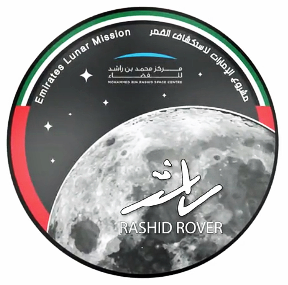
Source: MBRSpaceCenter tweet

2. Japan’s ispace HAKUTO-R lunar lander

The Japanese firm ispace, inc. was founded in September 2010, with headquarters in Tokyo, a U.S. office in Denver, CO, and a European office in Luxembourg.  Their website is here: https://ispace-inc.com

ispace’s HAKUTO team was one of six finalist teams competing for the Google Lunar XPRIZE. On 15 December 2017, XPRIZE reported,” Congratulations to Google Lunar XPRIZE Team HAKUTO for raising $90.2 million in Series A funding toward the development of a lunar lander and future lunar missions! This is the biggest investment to date for an XPRIZE team, and sends a strong signal that commercial lunar exploration is on the trajectory to success. One of the main goals of the Google Lunar XPRIZE is to revolutionize lunar exploration by spurring innovation in the private space sector, and this announcement demonstrates that there is strong market interest in innovative robotic solutions for sustainable exploration and development of the Moon. The XPRIZE Foundation looks forward to following Team HAKUTO as they progress toward their lunar mission!”

The Google Lunar XPRIZE was cancelled when it became clear that none of the finalist teams could meet the schedule for a lunar landing in 2018 and other constraints set for the competition.  Consequently, Team HAKUTO’s lander was not  flown on a mission to the Moon.

In April 2021, the Mohammed Bin Rashid Space Center (MBRSC) of the United Arab Emirates (UAE) signed a contract with ispace, under which ispace agreed to provide commercial payload delivery services for the Emirates Lunar Mission. After final testing in Germany, the ispace SERIES-1 (S1) lunar lander was ready in 2022 for the company’s ‘Mission 1,’ as part of its commercial lunar landing services program known as ‘HAKUTO-R’.

HAKUTO-R, aka SERIES-1 (S1), lunar lander general arrangement. 
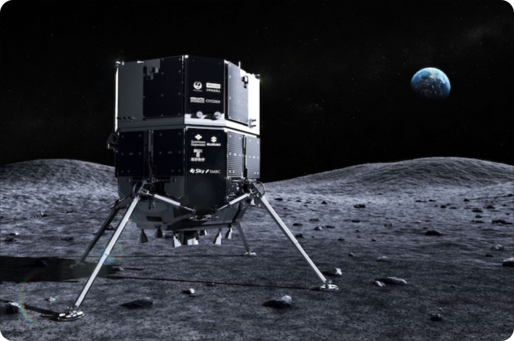
It is more than 7 feet (2.3 meters) tall. Source: ispace

After its launch on 11 December 2022, the lunar spacecraft has been flying a “low energy” trajectory to the Moon in order to minimize fuel use during the transit and, hence, maximizes the available mission payload. It will take nearly five months for the combined lander / rover spacecraft to reach the Moon in April 2023.
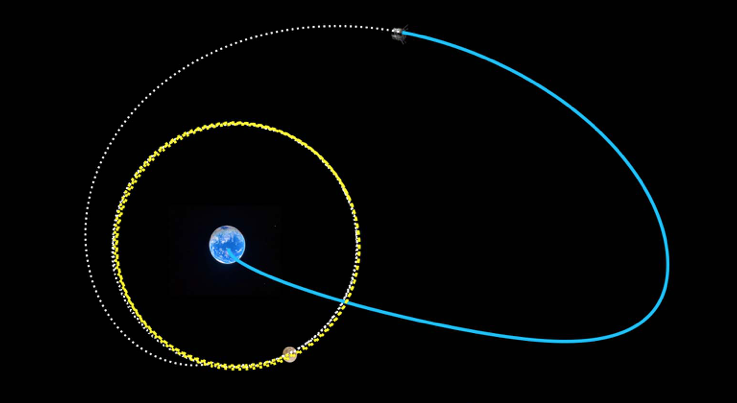
The low-energy trajectory being flown for the Emirates Lunar Mission shows spacecraft position (end of blue line, at top) as of 4 March 2023. The spacecraft will enter lunar orbit (yellow circle) in April 2023, before landing on the Moon.
Source: ispace

The primary landing site is the  Atlas crater in Lacus Somniorum (Lake of Dreams), which is a basaltic plain formed by flows of basaltic lava, located in the northeastern quadrant of the moon’s near side.

Lake of Dreams is highlighted in the yellow square.
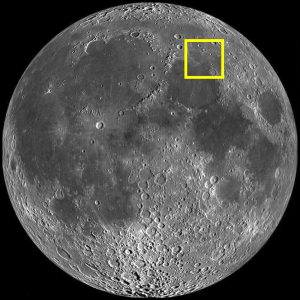
Source: The Lunar Registry
Hakuto-R Mission 1 Moon landing milestones. Source: ispace

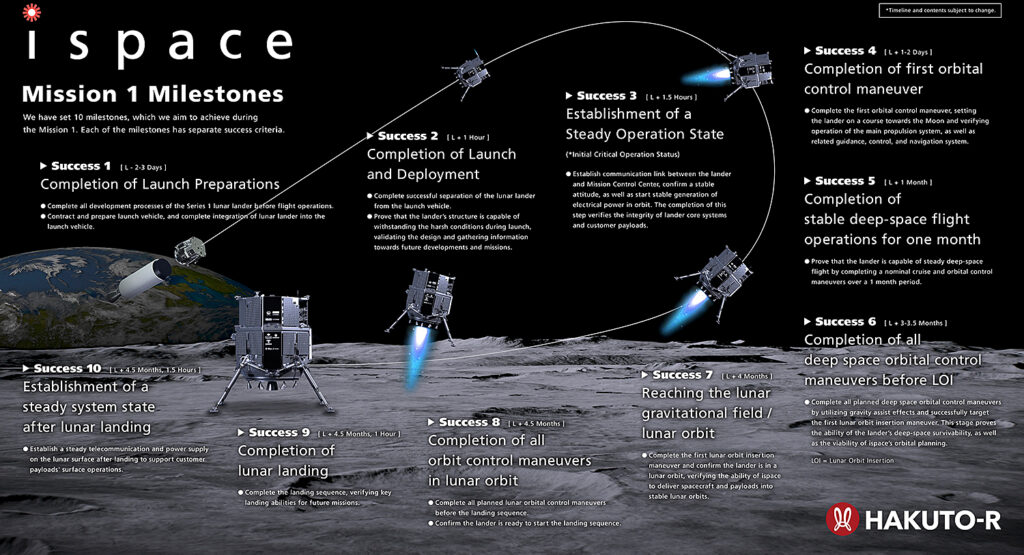
If successful, HAKUTO-R will also become the first commercial spacecraft ever to make a controlled landing on the moon.

After landing, the UAE’s Rashid rover will be deployed from the HAKUTO-R lander. In addition, the lander will deploy an orange-sized sphere from the Japanese Space Agency that will transform into a small wheeled robot that will move about on the lunar surface. 

3. UAE’s Rashid lunar rover

The Emirates Lunar Mission (ELM) team at the Mohammed bin Rashid Space Centre (MBRSC) is responsible for designing, manufacturing and developing the rover, which is named Rashid after Dubai’s royal family.  The ELM website is here: https://www.mbrsc.ae/service/emirates-lunar-mission/

The Rashid rover weighs just 22 pounds (10 kilograms) and, with four-wheel drive, can traverse a smooth surface at a maximum speed of 10 cm/sec (0.36 kph) and climb over an obstacle up to 10 cm (3.9 inches) tall and descend a 20-degree slope. 

Rashid rover general arrangement. Source: MBRSC

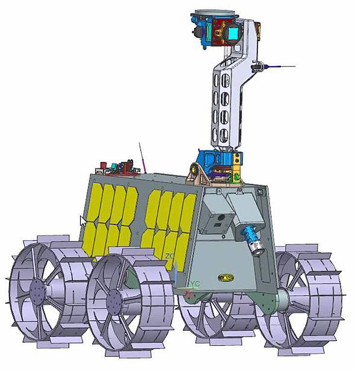
The Rashid rover is designed to operate on the Moon’s surface for one full lunar day (29.5 Earth days), during which time it will conduct studies of the lunar soil in a previously unexplored area. In addition, the rover will conduct engineering studies of mobility on the lunar surface and susceptibility of different materials to adhesion of lunar particles. The outer rims of this rover’s four wheels incorporate small sample panels to test how different materials cope with the abrasive lunar surface, including four samples contributed by the European Space Agency (ESA).

The diminutive rover carries the following scientific instruments:

  • Two high-resolution optical cameras (Cam-1 & Cam-2) are expected to take more than 1,000 still images of the Moon’s surface to assess the how lunar dust and rocks are distributed on the surface.
  • A “microscope” camera
  • A thermal imaging camera (Cam-T) will provide data for determining the thermal properties of lunar surface material.
  • Langmuir probes will analyze electric charge and electric fields at the lunar surface.
  • An inertial measurement unit to track the motion of the rover.

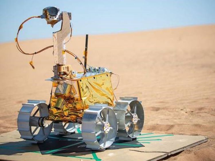
Mobility and communications tests of the completed rover were conducted in March 2022 in the Dubai desert.

Rashid rover during desert tests. Source: Gulf News (March 2022)

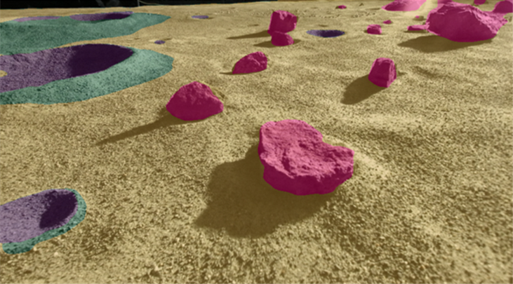
The Ottawa, Ontario company Mission Control Space Services has provided a deep-learning artificial intelligence (AI) system named MoonNet that will be used for identifying geologic features seen by the rover’s cameras. Mission Control Services reports, “Rashid will capture images of geological features on the lunar terrain and transmit them to the lander and into MoonNet. The output of MoonNet will be transmitted back to Earth and then distributed to science team members….Learning how effectively MoonNet can identify geological features, inform operators of potential hazards and support path planning activities will be key to validating the benefits of AI to support future robotic missions.”

This color-coded image is an example of the type of output the MoonNet AI system is expected to produce.
 Source: Mission Control Space Services

4. Landing attempt failed

The Hakuto-R lander crashed into the Moon on 25 April 2023 during its landing attempt.

In May 2023, the results of an ispace analysis of the landing failure were reported by Space.com:

“The private Japanese moon lander Hakuto-R crashed in late April during its milestone landing attempt because its onboard altitude sensor got confused by the rim of a lunar crater. the unexpected terrain feature led the lander’s onboard computer to decide that its altitude measurement was wrong and rely instead on a calculation based on its expected altitude at that point in the mission. As a result, the computer was convinced the probe was lower than it actually was, which led to the crash on April 25.”

“While the lander estimated its own altitude to be zero, or on the lunar surface, it was later determined to be at an altitude of approximately 5 kms [3.1 miles] above the lunar surface,” ispace said in a statement released on Friday (May 26). “After reaching the scheduled landing time, the lander continued to descend at a low speed until the propulsion system ran out of fuel. At that time, the controlled descent of the lander ceased, and it is believed to have free-fallen to the moon’s surface.”

On 23 May 2023, NASA reported that the its Lunar Reconnaissance Orbiter spacecraft had located the crash site of the UAE’s lunar spacecraft. The before and after views are shown in the following images.

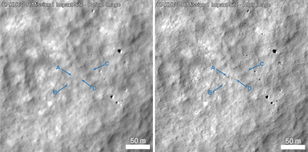
Hakuto-R crash site, before (left) and after (right) the crash. Source: NASA/GSFC/Arizona State University

5. The future

ispace future lunar plans

ispace reported, “ispace’s SERIES-2 (S2) lander is designed, manufactured, and will be launched from the United States. While the S2 lander leverages lessons learned from the company’s SERIES-1 (S1) lander, it is an evolved platform representing our next generation lander series with increased payload capacity, enhanced capabilities and featuring a modular design to accommodate orbital, stationary or rover payloads.”

Ispace was selected through the Commercial Lunar Payload Services (CLPS) initiative to deliver NASA payloads to the far side of the Moon using the SERIES-2 (S2) lander, starting in 2025.

UAE future lunar plans

In October 2022, the UAE announced that it was collaborating with China on a second lunar rover mission, which would be part of China’s planned 2026 Chang’e 7 lunar mission that will be targeted to land near the Moon’s south pole. These plans may be cancelled after the U.S. applied export restrictions in March 2023 on the Rashid 2 rover, which contains some US-built components. The U.S. cited its 1976 International Traffic in Arms Regulations (ITAR), which prohibit even the most common US-built items from being launched aboard Chinese rockets.

6. For more information

Future missions

Video

What Do You Put On The Borg Warner Trophy When An Autonomous Car Wins the Indy 500?

Peter Lobner

A year ago, this might have seemed like a foolish question.  An autonomous car racing in the Indianapolis 500 Mile Race?  Ha!  When pigs fly!

The Indy 500 Borg Warner Trophy. 
Source:  The359 – Flickr via Wikipedia

One of the first things you may notice about the Borg Warner Trophy is that the winning driver of each Indy 500 Race is commemorated with a small portrait/sculpture of their face in bas-relief along with a small plaque with their name, winning year and winning average speed. Today, 105 faces grace the trophy.

Borg Warner Trophy close-up.
Source: WISH-TV, Indianapolis, March 2016

The Indianapolis Motor Speedway (IMS) website provides the following details:

“The last driver to have his likeness placed on the original trophy was Bobby Rahal in 1986, as all the squares had been filled. A new base was added in 1987, and it was filled to capacity following Gil de Ferran’s victory in 2003. For 2004, Borg-Warner commissioned a new base that will not be filled to capacity until 2034.”

On 11 January 2021, the Indianapolis Motor Speedway along with Energy Systems network announced the Indy Autonomous Challenge (IAC), with the inaugural race taking place at the IMS on 23 October of 2021.  The goal of the IAC is to create the fastest autonomous race car that can complete a head-to-head 50 mile (80.5 km) race at IMS. The challenge, which offers $1.5 million in prize money, is geared towards college and university teams. The IAC website is here: https://www.indyautonomouschallenge.com

The IAC organizers state that this challenge was “inspired and advised by innovators who competed in the Defense Advanced Research Projects Agency (DARPA) Grand Challenge, which put forth a $1 million award in 2004 that created the modern automated vehicle industry.”

All teams will be racing an open-wheel, automated Dallara IL-15 race car that appears, at first glance, quite similar to conventional (piloted) 210 mph Dallara race cars used in the Indy Lights race series.  However, the IL-15 has been modified with hardware and controls to enable automation.  The automation systems include an advanced set of sensors (radar, lidar, optical cameras) and computers.  Each completed race car has a value of more than $1 million. The teams will focus primarily on writing the software that will process the sensor data and drive the cars.  When fully configured for the race, the IAC Dallara IL-15 will be the world’s fastest autonomous automotive vehicle.

Rendering of the autonomous Dallara IL-15.  Source: IAC
Rendering of the autonomous Dallara IL-15 on the IMS race track.  Source: IAC

Originally, 39 university teams from 11 counties and 14 states had applied to compete in the IAC.  As of mid-January 2021, the IAC website lists 24 teams still actively seeking to qualify for the race.  

The race winner will be the first team whose car crosses the finish line after a 20-lap (50 mile / 80.5 km) head-to-head race that is completed in less than 25 minutes.  This requires an average lap speed of at least 120 mph (193 kph) and an average lap time of less than 75 seconds around the 2.5 mile (4 km) IMS race track. 

In comparison, Indy Light races at IMS from 2003 to 2019 have had an average winning speed of 148.1 mph (238.3 kph) and an average winning lap time of 60.8 seconds.  All of these races were run with cars using a Dallara chassis. The highest winning average speed for an Indy Lights race at IMS was in 2018, when Colton Herta won in a Dallara-Mazda at an average speed of 195.0 mph (313.8 kph) and an average lap time of 46.1 seconds, with no cautions during the race.

Milestones preceding the autonomous race are listed on the IAC website here: https://www.indyautonomouschallenge.com/timeline

Key milestones include:

  • 27 – 29 May: Vehicle distribution to the teams
  • 5 – 6 June: Track practice #1
  • 4 – 6 September: Track practice #2
  • 19 – 20 October: Track practice #3
  • 21 – 22 October: Final race qualification
  • 23 October: Race day

The winning team will receive a prize of $1 million, with the second and third place teams receiving $250,000 and $50,000, respectively.

The IAC race will be held more than 17 years after the first of three DARPA Grand Challenge autonomous vehicle competitions that were instrumental in building the technical foundation and developing broad-based technical competencies related to autonomous vehicles.  A quick look at these DARPA Grand Challenge races may help put the upcoming IAC race in perspective.

The first DARPA Grand Challenge autonomous vehicle race was held on 13 March 2004.  From an initial field of 106 applicants, DARPA selected 25 finalists. After a series of pre-race trials, 15 teams qualified their vehicles for the race. The “race course” was a 140 mile (225 km) off-road route designated by GPS waypoints through the Mojave Desert, from Barstow, CA to Primm, NV.  You might remember that no vehicles completed the course and there was no winner of the $1 million prize. The vehicle that went furthest was the Carnegie Mellon Sandstorm, a modified Humvee sponsored by SAIC, Boeing and others.  Sandstorm broke down after completing 7.36 miles (11.84 km), just 5% of the course. 

A second Grand Challenge race was held 18 months later, on 8 October 2005. DARPA raised the prize money to $2 million for this 132 mile (212 km) off-road race. From an original field of 197 applicants, 23 teams qualified to have their vehicles on the starting line for the race.  In the end, five teams finished the course, four of them in under the 10-hour limit. Stanford University’s Stanley was the overall winner.  All but one of the 23 finalist teams traveled farther than the best vehicle in 2004.  This was a pretty remarkable improvement in autonomous vehicle performance in just 18 months.

In 2007, DARPA sponsored a different type of autonomous vehicle competition, the Urban Challenge.  DARPA describes this competition as follows:

“This event required teams to build an autonomous vehicle capable of driving in traffic, performing complex maneuvers such as merging, passing, parking, and negotiating intersections. As the day wore on, it became apparent to all that this race was going to have finishers. At 1:43 pm, “Boss”, the entry of the Carnegie Mellon Team, Tartan Racing, crossed the finish line first with a run time of just over four hours. Nineteen minutes later, Stanford University’s entry, “Junior,” crossed the finish line. It was a scene that would be repeated four more times as six robotic vehicles eventually crossed the finish line, an astounding feat for the teams and proving to the world that autonomous urban driving could become a reality. This event was groundbreaking as the first time autonomous vehicles have interacted with both manned and unmanned vehicle traffic in an urban environment.”

In January 2021, a production Tesla Model 3 with the new Full Self-Driving (FSD) Beta software package drove from San Francisco to Los Angeles with almost no human intervention.  I wonder how that Tesla Model 3 would have performed on the 2007 DARPA Urban Challenge.  You can read more about the SF – LA FSD trip at the following link: https://interestingengineering.com/tesla-full-self-driving-successfully-takes-model-3-from-sf-to-la

We’ve seen remarkable advances in the development of autonomous vehicles in the 17 years since the 2004 DARPA Grand Challenge race.  Is it unreasonable to think that an autonomous race car will become competitive with a piloted Indy race car during the next decade and compete in the Indy 500 before they run out of space on the Borg Warner Trophy in 2034?  If the autonomous racer wins the Indy 500, what will they put on the trophy to commemorate the victory? A silver bas-relief of a microchip?

I think I see a flying pig!

For more information on IAC and IMS

For more information on the DARPA Grand Challenges for autonomous vehicles

The Moon has Never Looked so Colorful

Peter Lobner

On 20 April 2020, the U.S. Geological Survey (USGS) released the first-ever comprehensive digital geologic map of the Moon.  The USGS described this high-resolution map as follows:

“The lunar map, called the ‘Unified Geologic Map of the Moon,’ will serve as the definitive blueprint of the moon’s surface geology for future human missions and will be invaluable for the international scientific community, educators and the public-at-large.”

Color-coded orthographic projections of the “Unified Geologic Map of the Moon” showing the geology of the Moon’s near side (left) and far side (right).  Source:  NASA/GSFC/USGS

You’ll find the USGS announcement here:  https://www.usgs.gov/news/usgs-releases-first-ever-comprehensive-geologic-map-moon

You can view an animated, rotating version of this map here:  https://www.youtube.com/watch?v=f2Nt7DxUV_k

This remarkable mapping product is the culmination of a decades-long project that started with the synthesis of six Apollo-era (late 1960s – 1970s) regional geologic maps that had been individually digitized and released in 2013 but not integrated into a single, consistent lunar map. 

This intermediate mapping product was updated based on data from the following more recent lunar satellite missions:

  • NASA’s Lunar Reconnaissance Orbiter (LRO) mission:
    • The Lunar Reconnaissance Orbiter Camera (LROC) is a system of three cameras that capture high resolution black and white images and moderate resolution multi-spectral images of the lunar surface: http://lroc.sese.asu.edu
    • Topography for the north and south poles was supplemented with Lunar Orbiter Laser Altimeter (LOLA) data: https://lola.gsfc.nasa.gov
  • JAXA’s (Japan Aerospace Exploration Agency) SELENE (SELenological and ENgineering Explorer) mission:

The final product is a seamless, globally consistent map that is available in several formats: geographic information system (GIS) format at 1:5,000,000-scale, PDF format at 1:10,000,000-scale, and jpeg format.

At the following link, you can download a large zip file (310 Mb) that contains a jpeg file (>24 Mb) with a Mercator projection of the lunar surface between 57°N and 57°S latitude, two polar stereographic projections of the polar regions from 55°N and 55°S latitudes to the poles, and a description of the symbols and color coding used in the maps.

https://astrogeology.usgs.gov/search/map/Moon/Geology/Unified_Geologic_Map_of_the_Moon_GIS_v2

These high-resolution maps are great for exploring the lunar surface in detail. A low-resolution copy (not suitable for browsing) is reproduced below.

For more information on the Unified Geologic Map of the Moon, refer to the paper by C. M. Fortezzo, et al., “Release of the digital Unified Global Geologic Map of the Moon at 1:5,000,000-scale,” which is available here:  https://www.hou.usra.edu/meetings/lpsc2020/pdf/2760.pdf

Antarctica – What’s Under All That Ice?

Peter Lobner, Updated 24 August 2021

From space, Antarctica gives the appearance of a large, ice-covered continental land mass surrounded by the Southern Ocean.  The satellite photo mosaic, below, reinforces that illusion.  Very little ice-free rock is visible, and it’s hard to distinguish between the continental ice sheet and ice shelves that extend into the sea.

Satellite mosaic image of Antarctica created by Dave Pape, 
adapted to the same orientation as the following maps. 
 Source.  https://geology.com/world/antarctica-satellite-image.shtml

The following topographical map presents the surface of Antarctica in more detail, and shows the many ice shelves (in grey) that extend beyond the actual coastline and into the sea.  The surface contour lines on the map are at 500 meter (1,640 ft) intervals.

Map of Antarctica and the Southern Ocean showing the topography of Antarctica (as blue lines), research stations of the United States and the United Kingdom (in red text), ice-free rock areas (in brown), ice shelves (in gray) and names of the major ocean water bodies (in blue uppercase text).
Source: LIMA Project (Landsat Image Mosaic of Antarctica) via Wikipedia

The highest elevation of the ice sheet is 4,093 m (13,428 ft) at Dome Argus (aka Dome A), which is located in the East Antarctic Ice Sheet, about 1,200 kilometers (746 miles) inland.  The highest land elevation in Antarctica is Mount Vinson, which reaches 4,892 meters (16,050 ft) on the north part of a larger mountain range known as Vinson Massif, near the base of the Antarctic Peninsula.  This topographical map does not provide information on the continental bed that underlies the massive ice sheets.

A look at the bedrock under the ice sheets: Bedmap2 and BedMachine

In 2001, the British Antarctic Survey (BAS) released a topographical map of the bedrock that underlies the Antarctic ice sheets and the coastal seabed derived from data collected by international consortia of scientists since the 1950s. The resulting dataset was called  BEDMAP1.  

In a 2013 paper, P. Fretwell, et al. (a very big team of co-authors), published the paper, “Bedmap2: Improved ice bed, surface and thickness datasets for Antarctica,” which included the following bed elevation map, with bed elevations color coded as indicated in the scale on the left.  As you can see, large portions of the Antarctic “continental” bedrock are below sea level.

Bedmap2 bed elevation grid.  Source:  Fretwell 2013, Fig. 9

You can read the 2013 Fretwell paper here:  https://www.the-cryosphere.net/7/375/2013/tc-7-375-2013.pdf

For an introduction to Antarctic ice sheet thickness, ice flows, and the topography of the underlying bedrock, please watch the following short (1:51) 2013 video, “Antarctic Bedrock,” by the National Aeronautics and Space Administration’s (NASA’s) Scientific Visualization Studio:

NASA explained:

  • “In 2013, BAS released an update of the topographic dataset called BEDMAP2 that incorporates twenty-five million measurements taken over the past two decades from the ground, air and space.”
  • “The topography of the bedrock under the Antarctic Ice Sheet is critical to understanding the dynamic motion of the ice sheet, its thickness and its influence on the surrounding ocean and global climate. This visualization compares the new BEDMAP2 dataset, released in 2013, to the original BEDMAP1 dataset, released in 2001, showing the improvements in resolution and coverage.  This visualization highlights the contribution that NASA’s mission Operation IceBridge made to this important dataset.”

On 12 December 2019, a University of California Irvine (UCI)-led team of glaciologists unveiled the most accurate portrait yet of the contours of the land beneath Antarctica’s ice sheet.  The new topographic map, named “BedMachine Antarctica,”  is shown below.

BedMachine Antarctica topographical map showing the underlying ground features and the large portions of the continental bed that are below sea level.  
 Credit: Mathieu Morlighem / UCI

UCI reported:

  • “The new Antarctic bed topography product was constructed using ice thickness data from 19 different research institutes dating back to 1967, encompassing nearly a million line-miles of radar soundings. In addition, BedMachine’s creators utilized ice shelf bathymetry measurements from NASA’s Operation IceBridge campaigns, as well as ice flow velocity and seismic information, where available. Some of this same data has been employed in other topography mapping projects, yielding similar results when viewed broadly.”
  • “By basing its results on ice surface velocity in addition to ice thickness data from radar soundings, BedMachine is able to present a more accurate, high-resolution depiction of the bed topography. This methodology has been successfully employed in Greenland in recent years, transforming cryosphere researchers’ understanding of ice dynamics, ocean circulation and the mechanisms of glacier retreat.”
  • “BedMachine relies on the fundamental physics-based method of mass conservation to discern what lies between the radar sounding lines, utilizing highly detailed information on ice flow motion that dictates how ice moves around the varied contours of the bed.”

The net result is a much higher resolution topographical map of the bedrock that underlies the Antarctic ice sheets.  The authors note:“This transformative description of bed topography redefines the high- and lower-risk sectors for rapid sea level rise from Antarctica; it will also significantly impact model projections of sea level rise from Antarctica in the coming centuries.”

You can take a visual tour of BedMachine’s high-precision model of Antarctic’s ice bed topography here.  Enjoy your trip.

There is significant geothermal heating under parts of Antarctica’s bedrock

West Antarctica and the Antarctic Peninsula form a connected rift / fault zone that includes about 60 active and semi-active volcanoes, which are shown as red dots in the following map.  

Volcanoes located along the branching West Antarctic Fault/Rift System.
Source:  James Kamis, Plate Climatology, 4 July 2017

In a 29 June 2018 article on the Plate Climatology website, author James Kamis presents evidence that the fault / rift system underlying West Antarctica generates a significant geothermal heat flow into the bedrock and is the source of volcanic eruptions and sub-glacial volcanic activity in the region.  The heat flow into the bedrock and the observed volcanic activity both contribute to the glacial melting observed in the region.  You can read this article here:

http://www.plateclimatology.com/geologic-forces-fueling-west-antarcticas-larsen-ice-shelf-cracks/

The correlation between the locations of the West Antarctic volcanoes and the regions of higher heat flux within the fault / rift system are evident in the following map, which was developed in 2017 by a multi-national team.

Geothermal heat flux distribution at the ice-rock interface superimposed on subglacial topography.  Source:  Martos, et al., Geophysical Research Letter 10.1002/2017GL075609, 30 Nov 2017

The authors note: “Direct observations of heat flux are difficult to obtain in Antarctica, and until now continent-wide heat flux maps have only been derived from low-resolution satellite magnetic and seismological data. We present a high-resolution heat flux map and associated uncertainty derived from spectral analysis of the most advanced continental compilation of airborne magnetic data. …. Our high-resolution heat flux map and its uncertainty distribution provide an important new boundary condition to be used in studies on future subglacial hydrology, ice sheet dynamics, and sea level change.”  This Geophysical Research Letter is available here:  

https://agupubs.onlinelibrary.wiley.com/doi/pdf/10.1002/2017GL075609

The results of six Antarctic heat flux models developed from 2004 to 2017 were compared by Brice Van Liefferinge in his 2018 PhD thesis.  His results, shown below, are presented on the Cryosphere Sciences website of the European Sciences Union (EGU). 

Spatial distributions of geothermal heat flux: (A) Pollard et al. (2005) constant values, (B) Shapiro and Ritzwoller (2004): seismic model, (C) Fox Maule et al. (2005): magnetic measurements, (D) Purucker (2013): magnetic measurements, (E) An et al. (2015): seismic model and (F) Martos et al. (2017): high resolution magnetic measurements.  Source:  Brice Van Liefferinge (2018) PhD Thesis.

Regarding his comparison of Antarctic heat flux models, Van Liefferinge reported:  

  • “As a result, we know that the geology determines the magnitude of the geothermal heat flux and the geology is not homogeneous underneath the Antarctic Ice Sheet:  West Antarctica and East Antarctica are significantly distinct in their crustal rock formation processes and ages.”
  • “To sum up, although all geothermal heat flux data sets agree on continent scales (with higher values under the West Antarctic ice sheet and lower values under East Antarctica), there is a lot of variability in the predicted geothermal heat flux from one data set to the next on smaller scales. A lot of work remains to be done …” 

The effects of geothermal heating are particularly noticeable at Deception Island, which is part of a collapsed and still active volcanic crater near the tip of the Antarctic Peninsula.  This high heat flow volcano is in the same major fault zone as the rapidly melting / breaking-up Larsen Ice Shelf.  The following map shows the faults and volcanoes in this region.  

Key geological features in the Larsen “C” sea ice segment area.  
Source:  James Kamis, Plate Climatology, 4 July 2017
Tourists enjoying the geothermally heated ocean water at Deception Island.  
Source: Public domain

So, if you take a cruise to Antarctica and the Cruise Director offers a “polar bear” plunge, I suggest that you wait until the ship arrives at Deception Island.  Remember, this warm water is not due to climate change.  You’re in a volcano.

For more information on Bedmap 2 and BedMachine:

  • “Antarctic Bedrock,” Visualizations by Cindy Starr,  NASA Scientific Visualization Studio, Released on June 4, 2013:  https://svs.gsfc.nasa.gov/4060
  • Morlighem, M., Rignot, E., Binder, T. et al. “Deep glacial troughs and stabilizing ridges unveiled beneath the margins of the Antarctic ice sheet,” Nature Geoscience (2019) doi:10.1038/s41561-019-0510-8:  https://www.nature.com/articles/s41561-019-0510-8

More information on geothermal heating in the West Antarctic rift / fault zone:

NOAA’s Monthly Climate Summaries are Worth Your Attention

Peter Lobner

The National Oceanic and Atmospheric Administration’s (NOAA’s) National Centers for Environmental Information (NCEI) are responsible for “preserving, monitoring, assessing, and providing public access to the Nation’s treasure of climate and historical weather data and information.”  The main NOAA / NCEI website is here:

https://www.ncdc.noaa.gov

The “State of the Climate” is a collection of monthly summaries recapping climate-related occurrences on both a global and national scale.  Your starting point for accessing this collection is here:

https://www.ncdc.noaa.gov/sotc/

The following monthly summaries are available.

I’d like to direct your attention to two particularly impressive monthly summaries:

  • Global Summary Information, which provides a comprehensive top-level view, including the Sea Ice Index
  • Global Climate Report, which provides more information on temperature and precipitation, but excludes the Sea Ice Index information

Here are some of the graphics from the Global Climate Report for June 2019.

Source: NOAA NCEI
Source: NOAA NCEI

NOAA offered the following synopsis of the global climate for June 2019.

  • The month of June was characterized by warmer-than-average temperatures across much of the world. The most notable warm June 2019 temperature departures from average were observed across central and eastern Europe, northern Russia, northeastern Canada, and southern parts of South America.
  • Averaged as a whole, the June 2019 global land and ocean temperature departure from average was the highest for June since global records began in 1880.
  • Nine of the 10 warmest Junes have occurred since 2010.

For more details, see the online June 2019 Global Climate Reportat the following link:

https://www.ncdc.noaa.gov/sotc/global/201906

A complementary NOAA climate data resource is the National Snow & Ice Data Center’s (NSIDC’s) Sea Ice Index, which provides monthly and daily quick looks at Arctic-wide and Antarctic-wide changes in sea ice. It is a source for consistently processed ice extent and concentration images and data values since 1979. Maps show sea ice extent with an outline of the 30-year (1981-2010) median extent for the corresponding month or day. Other maps show sea ice concentration and anomalies and trends in concentration.  In addition, there are several tools you can use on this website to animate a series of monthly images or to compare anomalies or trends.  You’ll find the Sea Ice Index here:

https://nsidc.org/data/seaice_index/

The Arctic sea ice extent for June 2019 and the latest daily results for 23 July 2019 are shown in the following graphics, which show the rapid shrinkage of the ice pack during the Arctic summer.  NOAA reported that the June 2019 Arctic sea ice extent was 10.5% below the 30-year (1981 – 2010) average.  This is the second smallest June Arctic sea ice extent since satellite records began in 1979.

Source:  NOAA NSIDC
Source:  NOAA NSIDC

The monthly Antarctic results for June 2019 and the latest daily results for 23 July 2019 are shown in the following graphics, which show the growth of the Antarctic ice pack during the southern winter season. NOAA reported that the June 2019 Antarctic sea ice extent was 8.5% below the 30-year (1981 – 2010) average.  This is the smallest June Antarctic sea ice extent on record.

Source:  NOAA NSIDC
Source:  NOAA NSIDC

I hope you enjoy exploring NOAA’s “State of the Climate” collection of monthly summaries.

Declassified Military Satellite Imagery has Applications in a Wide Variety of Civilian Geospatial Studies

Peter Lobner, updated 26 October 2023

1. Overview of US military optical reconnaissance satellite programs

The National Reconnaissance Office (NRO) is responsible for developing and operating space reconnaissance systems and conducting intelligence-related activities for US national security.  NRO developed several generations of classified Keyhole (KH) military optical reconnaissance satellites that have been the primary sources of Earth imagery for the US Department of Defense (DoD) and intelligence agencies.  NRO’s website is here:

https://www.nro.gov

NRO’s early generations of Keyhole satellites were placed in low Earth orbits, acquired the desired photographic images on film during relatively short-duration missions, and then returned the film to Earth in small reentry capsules for airborne recovery. After recovery, the film was processed and analyzed.  The first US military optical reconnaissance satellite program, code named CORONA, pioneered the development and refinement of the technologies, equipment and systems needed to deploy an operational orbital optical reconnaissance capability. The first successful CORONA film recovery occurred on 19 August 1960.

Specially modified US Air Force C-119J aircraft recovers a
CORONA film canister in flight.  Source: US Air Force
First reconnaissance picture taken in orbit and successfully recovered on Earth;  taken on 18 August 1960 by a CORONA KH-1 satellite dubbed Discoverer 14.  Image shows the Mys Shmidta airfield in the Chukotka region of the Russian Arctic, with a resolution of about 40 feet (12.2 meters).  Source: Wikipedia

Keyhole satellites are identified by a code word and a “KH” designator, as summarized in the following table.

In 1976, NRO deployed its first electronic imaging optical reconnaissance satellite known as KENNEN KH-11 (renamed CRYSTAL in 1982), which eventually replaced the KH-9, and brought an end to reconnaissance satellite missions requiring film return.  The KH-11 flies long-duration missions and returns its digital images in near real time to ground stations for processing and analysis.  The KH-11, or an advanced version sometimes referred to as the KH-12, is operational today.

US film-return reconnaissance satellites from KH-1 to KH-9 shown to scale
with the KH-11 electronic imaging reconaissance satellite.  
Credit: Giuseppe De Chiara and The Space Review.

Geospatial intelligence, or GEOINT, is the exploitation and analysis of imagery and geospatial information to describe, assess and visually depict physical features and geographically referenced activities on the Earth. GEOINT consists of imagery, imagery intelligence and geospatial information.  Satellite imagery from Keyhole reconnaissance satellites is an important information source for national security-related GEOINT activities.

The National Geospatial-Intelligence Agency (NGA), which was formed in 2003, has the primary mission of collecting, analyzing, and distributing GEOINT in support of national security.  NGA’s predecessor agencies, with comparable missions, were:

  • National Imagery and Mapping Agency (NIMA), 1996 – 2003
  • National Photographic Interpretation Center (NPIC), a joint project of the Central Intelligence Agency (CIA) and DoD, 1961 – 1996

The NGA’s web homepage, at the following link: https://www.nga.mil/Pages/Default.aspx

The NGA’s webpage for declassified satellite imagery is here: https://www.nga.mil/ProductsServices/Pages/Imagery.aspx

2. The advent of the US civilian Earth observation programs

Collecting Earth imagery from orbit became an operational US military capability more than a decade before the start of the joint National Aeronautics & Space Administration (NASA) / US Geological Survey (USGS) civilian Landsat Earth observation program.  The first Landsat satellite was launched on 23 July 1972 with two electronic observing systems, both of which had a spatial resolution of about 80 meters (262 feet). 

Since 1972, Landsat satellites have continuously acquired low-to-moderate resolution digital images of the Earth’s land surface, providing long-term data about the status of natural resources and the environment. Resolution of the current generation multi-spectral scanner on Landsat 9 is 30 meters (98 feet) in visible light bands. 

You’ll find more information on the Landsat program on the USGS website here: https://www.usgs.gov/land-resources/nli/landsat

3. Declassification of certain military reconnaissance satellite imagery

All military reconnaissance satellite imagery was highly classified until 1995, when some imagery from early defense reconnaissance satellite programs was declassified.  The USGS explains:

“The images were originally used for reconnaissance and to produce maps for U.S. intelligence agencies. In 1992, an Environmental Task Force evaluated the application of early satellite data for environmental studies. Since the CORONA, ARGON, and LANYARD data were no longer critical to national security and could be of historical value for global change research, the images were declassified by Executive Order 12951 in 1995”

You can read Executive Order 12951 here: https://www.govinfo.gov/content/pkg/WCPD-1995-02-27/pdf/WCPD-1995-02-27-Pg304.pdf

Additional sets of military reconnaissance satellite imagery were declassified in 2002 and 2011 based on extensions of Executive Order 12951.

The declassified imagery is held by the following two organizations:

  • The original film is held by the National Archives and Records Administration (NARA).
  • Duplicate film held in the USGS Earth Resources Observation and Science (EROS) Center archive is used to produce digital copies of the imagery for distribution to users.

The declassified military satellite imagery available in the EROS archive is summarized below:

USGS EROS Archive – Declassified Satellite Imagery – 1 (1960 to 1972)

  • This set of photos, declassified in 1995, consists of more than 860,000 images of the Earth’s surface from the CORONA, ARGON, and LANYARD satellite systems.
  • CORONA image resolution improved from 40 feet (12.2 meters) for the KH-1 to about 6 feet (1.8 meters) for the KH-4B.
  • KH-5 ARGON image resolution was about 460 feet (140 meters).
  • KH-6 LANYARD  image resolution was about 6 feet (1.8 meters).

USGS EROS Archive – Declassified Satellite Imagery – 2 (1963 to 1980)

  • This set of photos, declassified in 2002, consists of photographs from the KH-7 GAMBIT surveillance system and KH-9 HEXAGON mapping program.
  • KH-7 image resolution is 2 to 4 feet (0.6 to 1.2 meters).  About 18,000 black-and-white images and 230 color images are available.
  • The KH-9 mapping camera was designed to support mapping requirements and exact positioning of geographical points. Not all KH-9 satellite missions included a mapping camera.  Image resolution is 20 to 30 feet (6 to 9 meters); significantly better than the 98 feet (30 meter) resolution of LANDSAT imagery.  About 29,000 mapping images are available.

USGS EROS Archive – Declassified Satellite Imagery – 3 (1971 to 1984)

  • This set of photos, declassified in 2011, consists of more photographs from the KH-9 HEXAGON mapping program.  Image resolution is 20 to 30 feet (6 to 9 meters).

More information on the declassified imagery resources is available from the USGS EROS Archive – Products Overview webpage at the following link (see heading “Declassified Data”): https://www.usgs.gov/centers/eros/science/usgs-eros-archive-products-overview?qt-science_center_objects=0#qt-science_center_objects

4.  Example applications of declassified military reconnaissance satellite imagery

The declassified military reconnaissance satellite imagery provides views of the Earth starting in the early 1960s, more than a decade before civilian Earth observation satellites became operational.  The military reconnaissance satellite imagery, except from ARGON KH-5, is higher resolution than is available today from Landsat civilian earth observation satellites. The declassified imagery is an important supplement to other Earth imagery sources.  Several examples applications of the declassified imagery are described below.

4.1 Assessing Aral Sea depletion

USGS reports: “The Aral Sea once covered about 68,000 square kilometers, a little bigger than the U.S. state of West Virginia. It was the 4th largest lake in the world. It is now only about 10% of the size it was in 1960…..In the 1990s, a dam was built to prevent North Aral water from flowing into the South Aral. It was rebuilt in 2005 and named the Kok-Aral Dam…..The North Aral has stabilized but the South Aral has continued to shrink and become saltier. Up until the 1960s, Aral Sea salinity was around 10 grams per liter, less than one-third the salinity of the ocean. The salinity level now exceeds 100 grams per liter in the South Aral, which is about three times saltier than the ocean.”

On the USGS website, the “Earthshots: Satellite Images of Environmental Change” webpages show the visible changes at many locations on Earth over a 50+ year time period.  The table of contents to the Earthshots webpages is shown below and is at the following link: http:// https://earthshots.usgs.gov/earthshots/

USGS Earthshots Table of Contents

For the Aral Sea region, the Earthshots photo sequences start with ARGON KH-5 photos taken in 1964.  Below are three screenshots  of the USGS Earthshots pages showing the KH-5 images for the whole the Aral Sea, the North Aral Sea region and the South Aral Sea region. You can explore the Aral Sea Earthshots photo sequences at the following link: https://earthshots.usgs.gov/earthshots/node/91#ad-image-0-0

4.2 Assessing Antarctic ice shelf condition

In a 7 June 2016 article entitled, ”Spy satellites reveal early start to Antarctic ice shelf collapse,” Thomas Sumner reported:

“Analyzing declassified images from spy satellites, researchers discovered that the downhill flow of ice on Antarctica’s Larsen B ice shelf was already accelerating as early as the 1960s and ’70s. By the late 1980s, the average ice velocity at the front of the shelf was around 20 percent faster than in the preceding decades,….”

You can read the complete article on the ScienceNews website here: https://www.sciencenews.org/article/spy-satellites-reveal-early-start-antarctic-ice-shelf-collapse

Satellite images taken by the ARGON KH-5 satellite have revealed how the accelerated movement that triggered the collapse of the Larsen B ice shelf on the east side of the Antarctic Peninsula began in the 1960s. The declassified images taken by the satellite on 29 August 1963 and 1 September 1963 are pictured right.  
Source: Daily Mail, 10 June 2016

4.3 Assessing Himalayan glacier condition

In a 19 June 2019 paper “Acceleration of ice loss across the Himalayas over the past 40 years,” the authors, reported on the use of HEXAGON KH-9 mapping camera imagery to improve their understanding of trends affecting the Himalayan glaciers from 1975 to 2016:

“Himalayan glaciers supply meltwater to densely populated catchments in South Asia, and regional observations of glacier change over multiple decades are needed to understand climate drivers and assess resulting impacts on glacier-fed rivers. Here, we quantify changes in ice thickness during the intervals 1975–2000 and 2000–2016 across the Himalayas, using a set of digital elevation models derived from cold war–era spy satellite film and modern stereo satellite imagery.”

“The majority of the KH-9 images here were acquired within a 3-year interval (1973–1976), and we processed a total of 42 images to provide sufficient spatial coverage.”

“We observe consistent ice loss along the entire 2000-km transect for both intervals and find a doubling of the average loss rate during 2000–2016.”

“Our compilation includes glaciers comprising approximately 34% of the total glacierized area in the region, which represents roughly 55% of the total ice volume based on recent ice thickness estimates.”

You can read the complete paper by J. M. Maurer, et al., on the Science Advances website here: https://advances.sciencemag.org/content/5/6/eaav7266

3-D image of the Himalayas derived from HEXAGON KH-9 satellite mapping photographs taken on December 20, 1975. Source:  J. M. Maurer/LDEO

4.4 Discovering archaeological sites

A. CORONA Atlas Project

The Center for Advanced Spatial Technologies, a University of Arkansas / U.S. Geological Survey collaboration, has undertaken the CORONA Atlas Project using military reconnaissance satellite imagery to create the “CORONA Atlas & Referencing System”. The current Atlas focuses on the Middle East and a small area of Peru, and is derived from 1,024 CORONA images taken on 50 missions. The Atlas contains 833 archaeological sites.

“In regions like the Middle East, CORONA imagery is particularly important for archaeology because urban development, agricultural intensification, and reservoir construction over the past several decades have obscured or destroyed countless archaeological sites and other ancient features such as roads and canals. These sites are often clearly visible on CORONA imagery, enabling researchers to map sites that have been lost and to discover many that have never before been documented. However, the unique imaging geometry of the CORONA satellite cameras, which produced long, narrow film strips, makes correcting spatial distortions in the images very challenging and has therefore limited their use by researchers.”

Screenshot of the CORONA Atlas showing regions in the Middle East
with data available.

CAST reports that they have “developed methods for efficient 

orthorectification of CORONA imagery and now provides free public access to our imagery database for non-commercial use. Images can be viewed online and full resolution images can be downloaded in NITF format.”  

The can explore the CORONA Atlas & Referencing System here: https://corona.cast.uark.edu

B. Dartmouth “Fertile Crescent” Study

In October 2023, a team from Dartmouth College published a paper that described their recent discovery of 396 Roman-era forts using declassified CORONA and HEXAGON spy satellite imagery of regions of Syria, Iraq and nearby “fertile crescent” territories of the eastern Mediterranean. The study area is shown in the following map. A previous aerial survey of the area in 1934 had identified 116 other forts in the same region.

Dartmouth study area. Source: J. Casana, et al. (26 October 2023)

The authors noted, “Perhaps the most significant realization from our work concerns the spatial distribution of the forts across the landscape, as this has major implications for our understanding of their intended purpose as well as for the administration of the eastern Roman frontier more generally.”

Comparison of the distribution of forts documented in the 1934 aerial survey (top)and forts found recently on declassified satellite imagery (bottom). Source: Figure 9, J. Casana, et al. (26 October 2023)

Examples of the new forts identified by the Dartmouth team in satellite imagery are shown in the following figures.

CORONA images showing three major sites: (A) Sura (NASA1401); (B) Resafa (NASA1398); and (C) Ain Sinu (CRN999). Source: Figure 3, J. Casana, et al. (26 October 2023)

Castellum at Tell Brak site in multiple images: (A) CORONA (1102, 17 December 1967); (B) CORONA (1105, 4 November 1968); (C) HEXAGON (1204, 17 November 1974); and (D) modern satellite imagery. Source: Figure 4, J. Casana, et al. (26 October 2023)

The teams paper concludes: “Finally, the discovery of such a large number of previously undocumented ancient forts in this well-studied region of the Near East is a testament to the power of remote-sensing technologies as transformative tools in contemporary archaeological research.”

4.5 Conducting commercial geospatial analytics over a broader period of time

The firm Orbital Insight, founded in 2013, is an example of commercial firms that are mining geospatial data and developing valuable information products for a wide range of customers. Orbital Insight reports:

“Orbital Insight turns millions of images into a big-picture understanding of Earth. Not only does this create unprecedented transparency, but it also empowers business and policy decision makers with new insights and unbiased knowledge of socio-economic trends. As the number of Earth-observing devices grows and their data output expands, Orbital Insight’s geospatial analytics platform finds observational truth in an interconnected world. We map out and quantify the world’s complexities so that organizations can make more informed decisions.”

“By applying artificial intelligence to satellite, UAV, and other geospatial data sources, we seek to discover and quantify societal and economic trends on Earth that are indistinguishable to the human eye. Combining this information with terrestrial data, such as mobile and location-based data, unlocks new sources of intelligence.”

The Orbital Insight website is here: https://orbitalinsight.com/company/

5. Additional reading related to US optical reconnaissance satellites

You’ll find more information on the NRO’s film-return, optical reconnaissance satellites (KH-1 to KH-9) at the following links:

  • Robert Perry, “A History of Satellite Reconnaissance,” Volumes I to V, National Reconnaissance Office (NRO), various dates 1973 – 1974; released under FOIA and available for download on the NASA Spaceflight.com website, here: https://forum.nasaspaceflight.com/index.php?topic=20232.0

You’ll find details on NRO’s electronic optical reconnaissance satellites (KH-11, KH-12) at the following links:

6. Additional reading related to civilian use of declassified spy satellite imagery

General:

Assessing Aral Sea depletion:

Assessing Antarctic ice sheet condition:

Assessing Himalayan glacier condition:

Discovering archaeological sites:

Remote Sensing Shows the Extent of Flooding from Hurricane Harvey and Other Large Flooding Events

Peter Lobner

Dartmouth Flood Observatory, at the University of Colorado, Boulder, CO, integrates international satellite data to develop a worldwide view of surface water issues, and can provide regional maps that show the extent of flooding in areas of interest. Data from many satellite sources are used, including NASA’s MODIS (Moderate Resolution Imaging Spectrometer) and Landsat, European Space Agency’s (ESA) Sentinel 1, ASI (Agenzia Spaziale Italiana) Cosmos-SkyMed, and Canadian Space Agency’s Radarsat 2.

The Dartmouth Flood Observatory homepage is here:

http://floodobservatory.colorado.edu

The world view of large flooding events as of 26 August 2017 is shown in the graphic.

Source: Dartmouth Flood Observatory

The following 31 August 2017 maps show the areas in Texas and Louisiana that were flooded by Hurricane Harvey also known as DFO flood event 4510). Red represents flooded areas, blue represents normal water extent, and dark grey represents urban areas.

Area mapSource: Dartmouth Flood Observatory

Here’s the link to these detailed flooding maps for Hurricane Harvey:

http://floodobservatory.colorado.edu/Events/2017USA4510/2017USA4510.html

This webpage also provides links to other information sources related to Hurricane Harvey.

The Dartmouth Flood Observatory maintains an archive of large flood events from 1985 to present. This archive is accessible online at the following link:

http://floodobservatory.colorado.edu/Archives/index.html

Dartmouth Flood Observatory is a member of the Global Flood Partnership (GFP), which describes itself as, “a cooperation framework between scientific organizations and flood disaster managers worldwide to develop flood observational and modeling infrastructure, leveraging on existing initiatives for better predicting and managing flood disaster impacts and flood risk globally.” For more information on the Global Flood Partnership, visit their homepage and portal at the following links:

https://gfp.jrc.ec.europa.eu/about-us

http://portal.gdacs.org/Global-Flood-Partnership

Lidar Remote Sensing Helps Archaeologists Uncover Lost City and Temple Complexes in Cambodia

Peter Lobner

In Cambodia, remote sensing is proving to be of great value for looking beneath a thick jungle canopy and detecting signs of ancient civilizations, including temples and other structures, villages, roads, and hydraulic engineering systems for water management. Building on a long history of archaeological research in the region, the Cambodian Archaeological Lidar Initiative (CALI) has become a leader in applying lidar remote sensing technology for this purpose. You’ll find the CALI website at the following link:

http://angkorlidar.org

Areas in Cambodia surveyed using lidar in 2012 and 2015 are shown in the following map.

Angkor Wat and vicinity_CALISource: Cambodian Archaeological LIDAR Initiative (CALI)

CALI describes its objectives as follows:

“Using innovative airborne laser scanning (‘lidar’) technology, CALI will uncover, map and compare archaeological landscapes around all the major temple complexes of Cambodia, with a view to understanding what role these complex and vulnerable water management schemes played in the growth and decline of early civilizations in SE Asia. CALI will evaluate the hypothesis that the Khmer civilization, in a bid to overcome the inherent constraints of a monsoon environment, became locked into rigid and inflexible traditions of urban development and large-scale hydraulic engineering that constrained their ability to adapt to rapidly-changing social, political and environmental circumstances.”

Lidar is a surveying technique that creates a 3-dimensional map of a surface by measuring the distance to a target by illuminating the target with laser light. A 3-D map is created by measuring the distances to a very large number of different targets and then processing the data to filter out unwanted reflections (i.e., reflections from vegetation) and build a “3-D point cloud” image of the surface. In essence, lidar removes the surface vegetation, as shown in the following figure, and produces a map with a much clearer view of surface features and topography than would be available from conventional photographic surveys.

Lidar sees thru vegetation_CALISource: Cambodian Archaeological LIDAR Initiative

CALI uses a Leica ALS70 lidar instrument. You’ll find the product specifications for the Leica ALS70 at the following link:

http://w3.leica-geosystems.com/downloads123/zz/airborne/ALS70/brochures/Leica_ALS70_6P_BRO_en.pdf

CALI conducts its surveys from a helicopter with GPS and additional avionics to help manage navigation on the survey flights and provide helicopter geospatial coordinates to the lidar. The helicopter also is equipped with downward-looking and forward-looking cameras to provide visual photographic references for the lidar maps.

Basic workflow in a lidar instrument is shown in the following diagram.

Lidar instrument workflow_Leica

An example of the resulting point cloud image produced by a lidar is shown below.

Example lidar point cloud_Leica

Here are two views of a site named Choeung Ek; the first is an optical photograph and the second is a lidar view that removes most of the vegetation. I think you’ll agree that structures appear much more clearly in the lidar image.

Choueng_Ek_Photo_CALISource: Cambodian Archaeological LIDAR InitiativeChoueng_Ek_Lidar_CALISource: Cambodian Archaeological LIDAR Initiative

An example of a lidar image for a larger site is shown in the following map of the central monuments of the well-researched and mapped site named Sambor Prei Kuk. CALI reported:

“The lidar data adds a whole new dimension though, showing a quite complex system of moats, waterways and other features that had not been mapped in detail before. This is just the central few sq km of the Sambor Prei Kuk data; we actually acquired about 200 sq km over the site and its environs.”

Sambor Prei Kuk lidar_CALISource: Cambodian Archaeological LIDAR Initiative

For more information on the lidar archaeological surveys in Cambodia, please refer to the following recent articles:

See the 18 July 2016 article by Annalee Newitz entitled, “How archaeologists found the lost medieval megacity of Angkor,” on the arsTECHNICA website at the following link:

http://arstechnica.com/science/2016/07/how-archaeologists-found-the-lost-medieval-megacity-of-angkor/?utm_source=howtogeek&utm_medium=email&utm_campaign=newsletter

On the Smithsonian magazine website, see the April 2016 article entitled, “The Lost City of Cambodia,” at the following link:

http://www.smithsonianmag.com/history/lost-city-cambodia-180958508/?no-ist

Also on the Smithsonian magazine website, see the 14 June 2016 article by Jason Daley entitled, “Laser Scans Reveal Massive Khmer Cities Hidden in the Cambodian Jungle,” at the following link:

http://www.smithsonianmag.com/smart-news/laser-scans-reveal-massive-khmer-cities-hidden-cambodian-jungle-180959395/

Synthetic Aperture Radar (SAR) and Inverse SAR (ISAR) Enable an Amazing Range of Remote Sensing Applications

Peter Lobner

SAR Basics

Synthetic Aperture Radar (SAR) is an imaging radar that operates at microwave frequencies and can “see” through clouds, smoke and foliage to reveal detailed images of the surface below in all weather conditions. Below is a SAR image superimposed on an optical image with clouds, showing how a SAR image can reveal surface details that cannot be seen in the optical image.

Example SAR imageSource: Cassidian radar, Eurimage optical

SAR systems usually are carried on airborne or space-based platforms, including manned aircraft, drones, and military and civilian satellites. Doppler shifts from the motion of the radar relative to the ground are used to electronically synthesize a longer antenna, where the synthetic length (L) of the aperture is equal to: L = v x t, where “v” is the relative velocity of the platform and “t” is the time period of observation. Depending on the altitude of the platform, “L” can be quite long. The time-multiplexed return signals from the radar antenna are electronically recombined to produce the desired images in real-time or post-processed later.

SAR principle

Source: Christian Wolff, http://www.radartutorial.eu/20.airborne/pic/sar_principle.print.png

This principle of SAR operation was first identified in 1951 by Carl Wiley and patented in 1954 as “Simultaneous Buildup Doppler.”

SAR Applications

There are many SAR applications, so I’ll just highlight a few.

Boeing E-8 JSTARS: The Joint Surveillance Target Attack Radar System is an airborne battle management, command and control, intelligence, surveillance and reconnaissance platform, the prototypes of which were first deployed by the U.S. Air Force during the 1991 Gulf War (Operation Desert Storm). The E-8 platform is a modified Boeing 707 with a 27 foot (8 meter) long, canoe-shaped radome under the forward fuselage that houses a 24 foot (7.3 meters) long, side-looking, multi-mode, phased array antenna that includes a SAR mode of operation. The USAF reports that this radar has a field of view of up to 120-degrees, covering nearly 19,305 square miles (50,000 square kilometers).

E-8 JSTARSSource: USAF

Lockheed SR-71: This Mach 3 high-altitude reconnaissance jet carried the Advanced Synthetic Aperture Radar System (ASARS-1) in its nose. ASARS-1 had a claimed 1 inch resolution in spot mode at a range of 25 to 85 nautical miles either side of the flight path.  This SAR also could map 20 to 100 nautical mile swaths on either side of the aircraft with lesser resolution.

SR-71Source: http://www.wvi.com/~sr71webmaster/sr_sensors_pg2.htm

Northrop RQ-4 Global Hawk: This is a large, multi-purpose, unmanned aerial vehicle (UAV) that can simultaneously carry out electro-optical, infrared, and synthetic aperture radar surveillance as well as high and low band signal intelligence gathering.

Global HawkSource: USAF

Below is a representative RQ-4 2-D SAR image that has been highlighted to show passable and impassable roads after severe hurricane damage in Haiti. This is an example of how SAR data can be used to support emergency management.

Global Hawk Haiti post-hurricane image123-F-0000X-103Source: USAF

NASA Space Shuttle: The Shuttle Radar Topography Mission (SRTM) used the Space-borne Imaging Radar (SIR-C) and X-Band Synthetic Aperture Radar (X-SAR) to map 140 mile (225 kilometer) wide swaths, imaging most of Earth’s land surface between 60 degrees north and 56 degrees south latitude. Radar antennae were mounted in the Space Shuttle’s cargo bay, and at the end of a deployable 60 meter mast that formed a long-baseline interferometer. The interferometric SAR data was used to generate very accurate 3-D surface profile maps of the terrain.

Shuttle STRMSource: NASA / Jet Propulsion Laboratory

An example of SRTM image quality is shown in the following X-SAR false-color digital elevation map of Mt. Cotopaxi in Ecuador.

Shuttle STRM imageSource: NASA / Jet Propulsion Laboratory

You can find more information on SRTM at the following link:

https://directory.eoportal.org/web/eoportal/satellite-missions/s/srtm

ESA’s Sentinel satellites: Refer to my 4 May 2015 post, “What Satellite Data Tell Us About the Earthquake in Nepal,” for information on how the European Space Agency (ESA) assisted earthquake response by rapidly generating a post-earthquake 3-D ground displacement map of Nepal using SAR data from multiple orbits (i.e., pre- and post-earthquake) of the Sentinel-1A satellite.  You can find more information on the ESA Sentinel SAR platform at the following link:

http://www.esa.int/Our_Activities/Observing_the_Earth/Copernicus/Sentinel-1/Introducing_Sentinel-1

You will find more general information on space-based SAR remote sensing applications, including many high-resolution images, in a 2013 European Space Agency (ESA) presentation, “Synthetic Aperture Radar (SAR): Principles and Applications”, by Alberto Moreira, at the following link:

https://earth.esa.int/documents/10174/642943/6-LTC2013-SAR-Moreira.pdf

ISAR Basics

ISAR technology uses the relative movement of the target rather than the emitter to create the synthetic aperture. The ISAR antenna can be mounted in a airborne platform. Alternatively, ISAR also can be used by one or more ground-based antennae to generate a 2-D or 3-D radar image of an object moving within the field of view.

ISAR Applications

Maritime surveillance: Maritime surveillance aircraft commonly use ISAR systems to detect, image and classify surface ships and other objects in all weather conditions. Because of different radar reflection characteristics of the sea, the hull, superstructure, and masts as the vessel moves on the surface of the sea, vessels usually stand out in ISAR images. There can be enough radar information derived from ship motion, including pitching and rolling, to allow the ISAR operator to manually or automatically determine the type of vessel being observed. The U.S. Navy’s new P-8 Poseidon patrol aircraft carry the AN/APY-10 multi-mode radar system that includes both SAR and ISAR modes of operation.

The principles behind ship classification is described in detail in the 1993 MIT paper, “An Automatic Ship Classification System for ISAR Imagery,” by M. Menon, E. Boudreau and P. Kolodzy, which you can download at the following link:

https://www.ll.mit.edu/publications/journal/pdf/vol06_no2/6.2.4.shipclassification.pdf

You can see in the following example ISAR image of a vessel at sea that vessel classification may not be obvious to the casual observer. I can see that an automated vessel classification system is very useful.

Ship ISAR image

Source: Blanco-del-Campo, A. et al., http://ieeexplore.ieee.org/xpl/login.jsp?tp=&arnumber=5595482&url=http%3A%2F%2Fieeexplore.ieee.org%2Fiel5%2F7361%2F5638351%2F05595482.pdf%3Farnumber%3D5595482

Imaging Objects in Space: Another ISAR (also called “delayed Doppler”) application is the use of one or more large radio telescopes to generate radar images of objects in space at very long ranges. The process for accomplishing this was described in a 1960 MIT Lincoln Laboratory paper, “Signal Processing for Radar Astronomy,” by R. Price and P.E. Green.

Currently, there are two powerful ground-based radars in the world capable of investigating solar system objects: the National Aeronautics and Space Administration (NASA) Goldstone Solar System Radar (GSSR) in California and the National Science Foundation (NSF) Arecibo Observatory in Puerto Rico. News releases on China’s new FAST radio telescope have not revealed if it also will be able to operate as a planetary radar (see my 18 February 2016 post).

The 230 foot (70 meter) GSSR has an 8.6 GHz (X-band) radar transmitter powered by two 250 kW klystrons. You can find details on GSSR and the techniques used for imaging space objects in the article, “Goldstone Solar System Radar Observatory: Earth-Based Planetary Mission Support and Unique Science Results,” which you can download at the following link:

http://echo.jpl.nasa.gov/asteroids/Slade_Benner_Silva_IEEE_Proceedings.pdf

The 1,000 foot (305 meter) Arecibo Observatory has a 2.38 GHz (S-band) radar transmitter, originally rated at 420 kW when it was installed in 1974, and upgraded in 1997 to 1 MW along with other significant upgrades to improve radio telescope and planetary radar performance. You will find details on the design and upgrades of Arecibo at the following link:

http://www.astro.wisc.edu/~sstanimi/Students/daltschuler_2.pdf

The following examples demonstrate the capabilities of Arecibo Observatory to image small bodies in the solar system.

  • In 1999, this radar imaged the Near-Earth Asteroid 1999 JM 8 at a distance of about 5.6 million miles (9 million km) from Earth. The ISAR images of this 1.9 mile 3-km) sized object had a resolution of about 49 feet (15 meters).
  • In November 1999, Arecibo Observatory imaged the tumbling Main-Belt Asteroid 216 Kleopatra. The resulting ISAR images, which made the cover of Science magazine, showed a dumbbell-shaped object with an approximate length of 134.8 miles (217 kilometers) and varying diameters up to 58.4 miles (94 kilometers).

Asteroid image  Source: Science

More details on the use of Arecibo Observatory to image planets and other bodies in the solar system can be found at the following link:

http://www.naic.edu/general/index.php?option=com_content&view=article&id=139&Itemid=474

The NASA / Jet Propulsion Laboratory Asteroid Radar Research website also contains information on the use of radar to map asteroids and includes many examples of asteroid radar images. Access this website at the following link:

http://echo.jpl.nasa.gov

Miniaturization

In recent years, SAR units have become smaller and more capable as hardware is miniaturized and better integrated. For example, Utah-based Barnard Microsystems offers a miniature SAR for use in lightweight UAVs such as the Boeing ScanEagle. The firm claimed that their two-pound “NanoSAR” radar, shown below, weighed one-tenth as much as the smallest standard SAR (typically 30 – 200 pounds; 13.6 – 90.7 kg) at the time it was announced in March 2008. Because of power limits dictated by the radar circuit boards and power supply limitations on small UAVs, the NanoSAR has a relatively short range and is intended for tactical use on UAVs flying at a typical ScanEagle UAV operational altitude of about 16,000 feet.

Barnard NanoSARSource: Barnard Microsystems

ScanEagle_UAVScanEagle UAV. Source: U.S. Marine Corps.

Nanyang Technological University, Singapore (NTU Singapore) recently announced that its scientists had developed a miniaturized SAR on a chip, which will allow SAR systems to be made a hundred times smaller than current ones.

?????????????????????????????????????????????????????????Source: NTU

NTU reports:

“The single-chip SAR transmitter/receiver is less than 10 sq. mm (0.015 sq. in.) in size, uses less than 200 milliwatts of electrical power and has a resolution of 20 cm (8 in.) or better. When packaged into a 3 X 4 X 5-cm (0.9 X 1.2 X 1.5 in.) module, the system weighs less than 100 grams (3.5 oz.), making it suitable for use in micro-UAVs and small satellites.”

NTU estimates that it will be 3 to 6 years before the chip is ready for commercial use. You can read the 29 February 2016 press release from NTU at the following link:

http://media.ntu.edu.sg/NewsReleases/Pages/newsdetail.aspx?news=c7aa67e7-c5ab-43ae-bbb3-b9105a0cd880

With such a small and hopefully low cost SAR that can be integrated with low-cost UAVs, I’m sure we’ll soon see many new and useful radar imaging applications.

Another Record-setting Year for Global Temperature

Peter Lobner

The National Aeronautics and Space Administration’s (NASA) Goddard Institute for Space Studies (GISS) released the results of an analysis by NASA and National Oceanic and Atmospheric Administration (NOAA) that showed that globally-averaged temperature in 2015 was the highest since modern record keeping began in 1880. You can read the NOAA / NASA press release at the following link:

http://www.giss.nasa.gov/research/news/20160120/

You can download a copy of the more detailed NOAA / NASA briefing at the following link:

http://www.giss.nasa.gov/research/news/20160120/noaa_nasa_global_analysis_2015.pdf

The analysis shows that globally-averaged temperature in 2015 exceeded the previous mark set in 2014 by 0.23 degrees Fahrenheit (0.13 degrees Celsius) and continued a warming trend, as shown in the following graph.

gistemp_graph_2015Source: NASA Goddard

In this graph, the zero on the y-axis is the average temperature for a 30-year period from 1951 to 1980. The trend lines show results for El Niño years (orange), La Niña years (blue), and all years (dashed line). The 2015 globally-averaged temperature was:

  • 57° F (0.87° C) above the 1951 to 1980 30-year (baseline) average, and
  • 62° F (0.90° C) above the 1901 to 2000 100-year (20th century) average

The distribution of global temperatures relative to the 1951 – 80 baseline is shown in the following charts.

NOAA:NASA briefing_1_Jan2016

NOAA:NASA briefing_2_Jan2016Source, both graphics: NOAA / NASA Annual Global Analysis for 2015

The NOAA / NASA press release cited above includes an animation that helps visualize Earth’s long-term warming trend based on data from 1880 to 2015. NOAA / NASA note that phenomena such as El Niño or La Niña, which warm or cool the tropical Pacific Ocean, can contribute to short-term variations in global average temperature. A warming El Niño was in effect for most of 2015

The full 2015 surface temperature data set and the complete methodology used by NOAA / NASA in their analysis are available to the public on the GISS Surface Temperature Analysis (GISTEMP) webpage at the following link:

http://data.giss.nasa.gov/gistemp/

The availability of the data and the analytical methodology allows the NOAA / NASA results to be subject to independent scrutiny. I commend NOAA and NASA for their openness in this matter, which will aid in reaching scientific consensus on the NOAA / NASA results.

This behavior by NOAA / NASA is a stark contrast to the United Nations (UN) Intergovernmental Panel on Climate Change (IPCC), which has failed to provide full public access to their underlying data and analytical methodologies and has been criticized for failing to rigorously apply the scientific method in their work. To help understand why the IPCC claim of “scientific consensus” is without merit, the Nongovernmental International Panel on Climate Change (NIPCC) published the book, “Why Scientists Disagree About Global Warming,” on 30 November 2015. You can download this document for free at the following link:

https://www.heartland.org/policy-documents/why-scientists-disagree-about-global-warming

To help put this in perspective, I thank cartoonist Wiley Miller for the following timely and insightful cartoon published on 20 January 2016. I challenge you to apply this cartoon to your understanding of the climate change debate.

Cartoon Science_Jan2016Source: San Diego Union Tribune