Category Archives: Remote Sensing

U.S. Drought Indicators Derived From GRACE Satellite Data

Peter Lobner

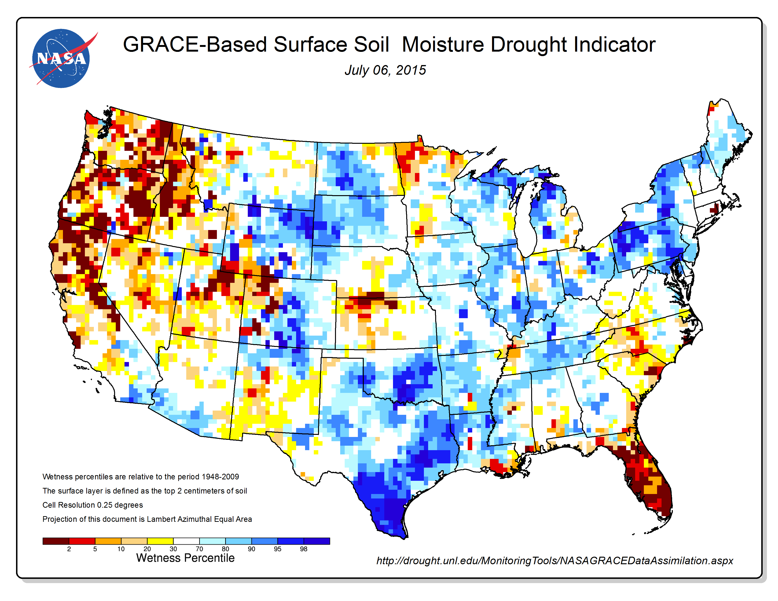
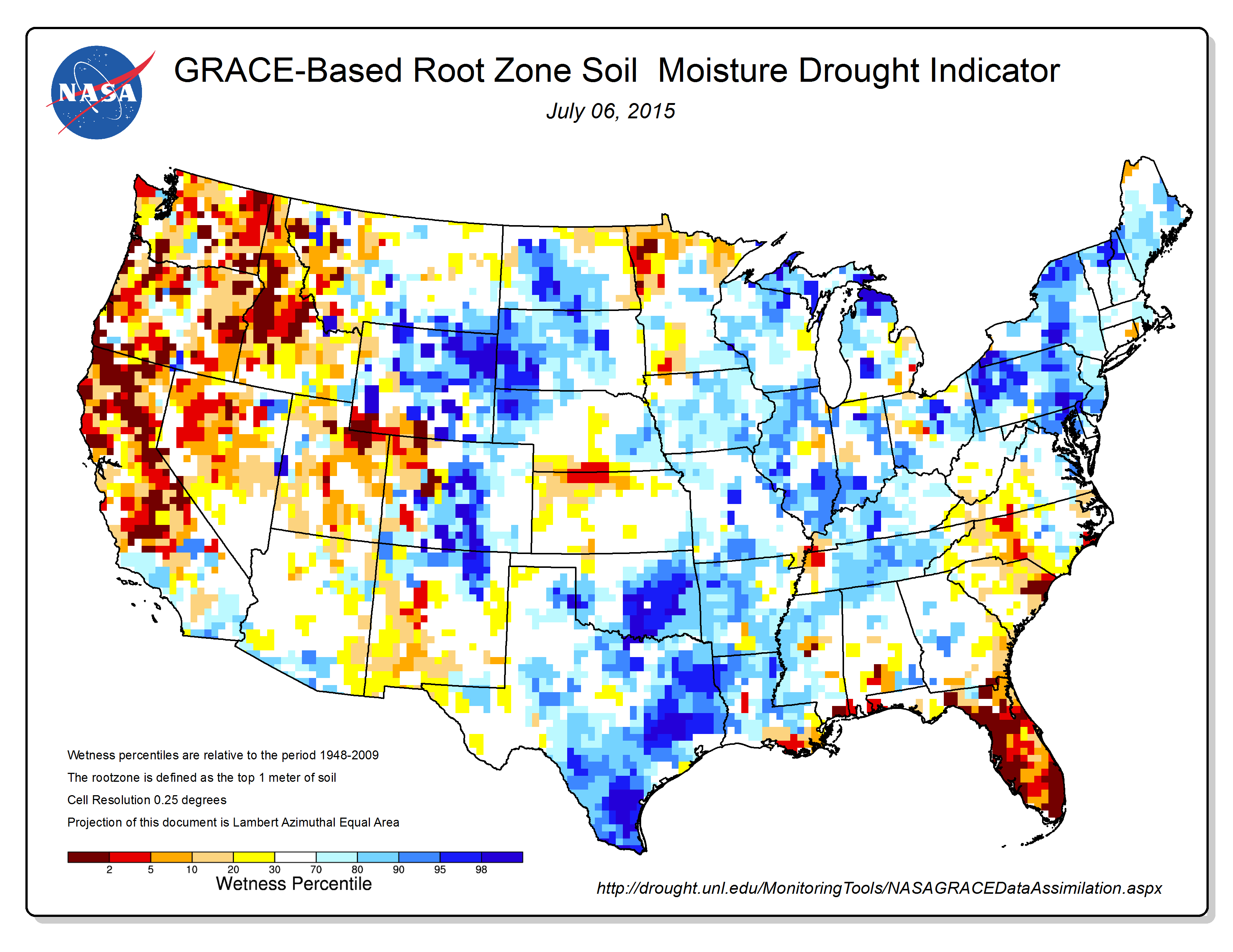
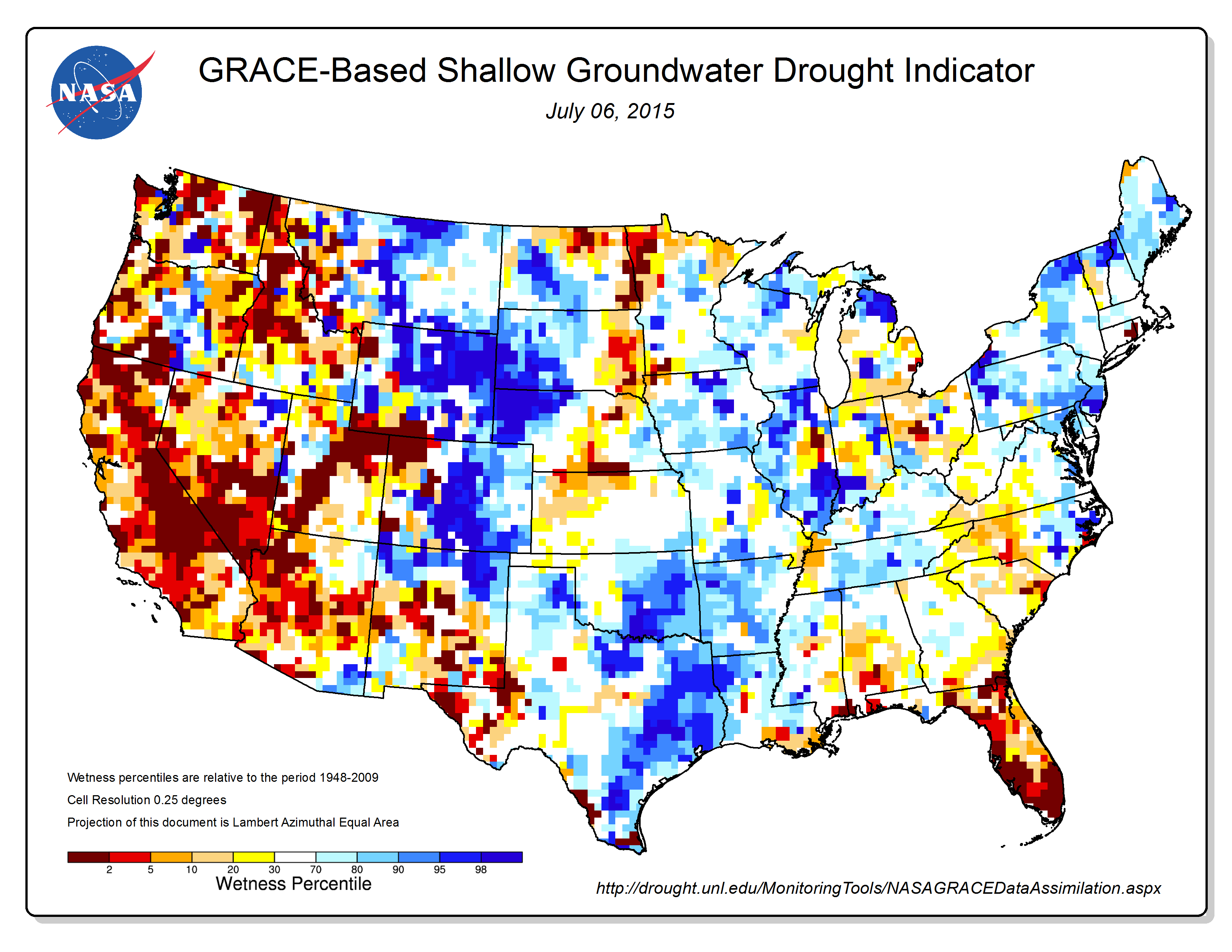
Scientists at NASA’s Goddard Space Flight Center generate groundwater and soil moisture drought indicators each week. They are based on terrestrial water storage observations derived from GRACE satellite data and integrated with other observations, using a sophisticated numerical model of land surface water and energy processes. You can see current results for the continental U.S. at the following link to the National Drought Mitigation Center (NMDC), University of Nebraska-Lincoln, website:

http://drought.unl.edu/MonitoringTools/NASAGRACEDataAssimilation.aspx

Drought indicator maps for 6 July 2015 are reproduced below for:

  • Surface soil moisture
  • Root zone soil moisture
  • Shallow groundwater

The drought in the U.S. West looks most severe in the shallow groundwater map.

You can find information on the twin GRACE (Gravity Recovery and Climate Experiment) satellites at the following link:

http://www.csr.utexas.edu/grace/

GRACE_6Jul15_SFSM

GRACE_6Jul15_RTZSM

GRACE_6Jul15_GWS

What Satellite Data Tell Us About the Earthquake in Nepal

Peter Lobner

A 7.8 magnitude earthquake occurred in the Gorkha region of Nepal on 29 April 2015. A ground displacement map based on data gathered from the Sentinel-1A satellite is shown below. In this image, yellow areas represent uplift and the blue areas represent subsidence.

image Source: ESA

Surface ruptures are places in the ground where the quake has cracked the rock all the way up to the surface. Preliminary satellite data indicate that the Nepal earthquake did not cause any new surface ruptures.

Interferometric analysis of before and after satellite data can be used to measure more subtle changes in the vertical height of the ground along the fault line. Preliminary results from an interferometric analysis by the European Space Agency (ESA), generated from satellite scans of Nepal from April 17 and 29, 2015, is shown in the following image.

image  Source: ESA

Each fringe of color represents 2.8 cm of ground deformation. Areas immediately south of the fault line, like Kathmandu, sank more than a meter into the ground as a result of the quake. Directly north of the fault slip, further into the Himalayas, the ground was lifted up by about a half meter, indicated by the yellow in the first image, above.

Imagine the difficulty of gathering such data from direct physical examination of the affected area.

Read the full article on the Nepal earthquake preliminary satellite data analysis at the following link:

http://www.wired.com/2015/05/satellite-data-tells-us-nepals-brutal-quake/

Read a general article on the use of satellite data to map earthquakes at the following link:

http://www.wired.com/2015/04/turns-satellites-work-great-mapping-earthquakes/

Where on Earth Does Lightning Flash Most?

Peter Lobner

According to satellite observations summarized in the following map, lightning occurs more often over land than over the oceans and more often closer to the equator.

image   Source: NASA

The map above shows the average yearly counts of lightning flashes per square kilometer from 1995 to 2013. The map was created using data collected from 1998–2013 by the Lightning Imaging Sensor (LIS) on NASA’s Tropical Rainfall Measuring Mission satellite, and from 1995–2000 by the Optical Transient Detector (OTD) on the OrbView 1/Microlab satellite. Flashes above 38 degrees North were observed by OTD only, as the satellite flew to higher latitudes.

Areas with the fewest number of flashes each year are gray or purple; areas with the largest number of lightning flashes—as many as 150 per year per square kilometer—are bright pink.  Be careful where you pitch your tent if you go on safari in central Africa.

Check out the story at the following link:

http://earthobservatory.nasa.gov/IOTD/view.php?id=85600

First Global Precipitation Map from NASA’s Global Precipitation Measurement Core Observatory

Peter Lobner
 
The Global Precipitation Measurement (GPM) Core Observatory – an initiative launched in 2014 as a collaboration between NASA and the Japan Aerospace Exploration Agency (JAXA) – acts as the standard to unify precipitation measurements from a network of 12 satellites. The result is NASA’s integrated multi-satellite retrievals for the GPM data product, called IMERG, which combines all of these data from 12 satellites into a single, seamless map.  An example of this global map is shown below:
 
Global precipitation map

Check out the short article and watch a short video showing the synthesized global precipitation map in action at the following NASA link:

http://www.nasa.gov/press/goddard/2015/february/nasa-releases-first-global-rainfall-and-snowfall-map-from-new-mission

More details on GMP mission can be found at the following NASA website:

http://www.nasa.gov/mission_pages/GPM/main/index.html